
HTML+JS+CSS Basic-3.css
3.css
3.1 The box model
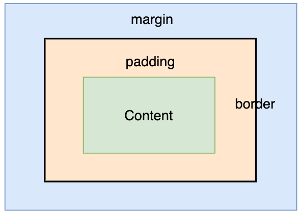
Every element in HTML is a box model, and each box model consists of four parts: content, padding, border, and margin, as shown below:
3.1.1 Contentcontent
content is the content part of the element, and the common styles are as follows:
**[1] width and height **
Block-level elements and inline elements are different: inline elements can not be set, width/height attribute is determined by its content (text, image size); block-level elements can be set width/height, the default width is 100% of the parent element, the default height is determined by the content (the content of the element or the height of the child elements and the sum).
1 | <div style="width:200px;height:100px;background-color:orange"></div> |
It is displayed as follows:

Description:
Multiples (em), pixels (px), and percentages (%) can be used when setting width and height.
[2]display
none: hides the element and does not take up any space;
block: set as a block-level element, allowing the setting of width and height;
inline-block: set as an inline element, will not occupy a line, and can set the width and height.
[3] background-color and background-image
background-color is used to set the background color and background-image is used to set the background image;
1 | /* Set the div's background color to red */ |
Note: When both background color and background image are set, only the background image takes effect.
among others:
The color attribute of CSS style can use
(1) Keywords, such as “red”, “blue”;
(2) Hexadecimal values, such as “#ff0000”, “#00ff00”;
(3) RGB, such as rgb(255,0,0), the first number means red, the second number means green, the third number means blue.
[4] color, font-size, text-align,overflow
color is used to set the text color; font-size is used to set the size of this text;
text-align is used to set the horizontal alignment of text, common values are:
(1) left: the text will be aligned relative to the left boundary of the element.
(2) right: the text will be aligned relative to the right boundary of the element.
(3) center: the text will be centered.
(4) justify: text content will be aligned to the left and right ends, and at the end of each line to adjust the word spacing, so that it occupies the entire line width.
Overflow indicates the display mode when the content exceeds the specified width and height of the box content area, common values are:
(1) hidden: hidden
(2) visible: normal display
(3) scroll to show the scroll bar;
3.1.2 Inner margins padding
The inner margin is the space between the content area and the border, and can be set by padding:
1 | div { |
At this point, padding acts on the top, bottom, left and right sides, and can be set up separately in the following way:
1 | div { |
Note: When the box background-color property is set, the background color extends to the fill area.
Note: Inline elements can set horizontal inner margins, not vertical ones.
3.1.3 border border
The border is the boundary around the content area and the padding, and the properties that can be set are border-style, border-width and border-color;
[1] border-style
Border style, common: solid, dashed, dotted, double
1 | div { |
[2] border-width
Border width, can be set by px;
1 | div { |
[3]border-color
Used to set the border color, no color by default
1 | div { |
Note: These three attributes can be used together, the order is irrelevant!
3.1.4 margin
The outer margin is the space outside the border, and the inner margin can be set by margin:
1 | div { |
At this time, the margin acts on the top, bottom, left and right sides, and can be set separately in the following way:
1 | div { |
Note: Inline elements can set horizontal outer margins, not vertical ones.
Note: Outer margins between multiple elements are not taken as a sum, but as a concatenation.
3.2 Positioning and Floating
[1] Position
css uses position to determine how an element is positioned in the following ways:
(1) static
Default positioning method, i.e. document flow.
1 | <head> |
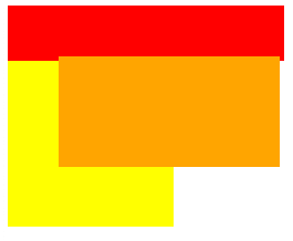
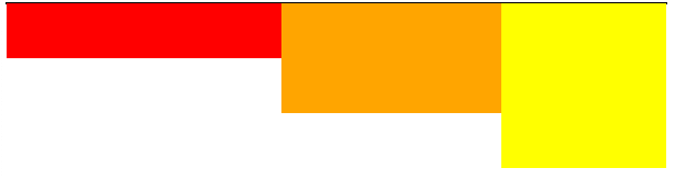
The document flow is shown below:
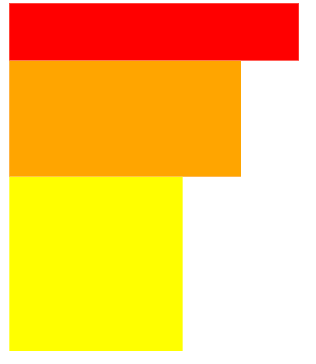
Analysis: node-1 (red), node-2 (orange), and node-3 (yellow) each occupy a row and are closely spaced.
(2) relative
Float relative to the original position; retain the occupied space.
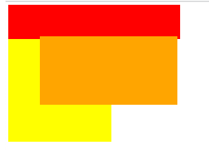
Modify the style of the node-2 node to:
1 | #node-2 { |
Show as:
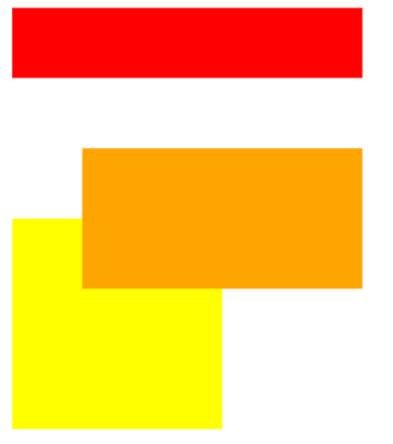
Analysis: node-1(red) and node-3(yellow) each occupy one row, node-2(orange) original space is kept, node-2(orange) is offset according to top and left relative to the original space.
(3) absolute
Floats relative to the positioned parent node (otherwise relative to the browser); does not preserve occupied space.
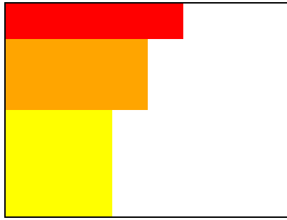
Change the style of the node-2 node to:
1 | #node-2 { |
Show as:
Analysis: node-1(red) and node-3(yellow) each occupy one row, node-2(orange) original space is not maintained, node-2(orange) is offset according to top and left relative to the top left corner of the browser.
(4) fixed
relative to the browser) for floating; does not keep the occupied space.
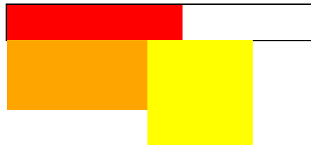
Change the style of the node-2 node to:
1 | #node-2 { |
Show as:
Analysis: node-1(red) and node-3(yellow) each occupy one row, node-2(orange) original space is not maintained, node-2(orange) is offset according to top and left relative to the top left corner of the browser.
[2] float
Use float attribute can make the element out of the original document flow, float attribute value range is as follows:
(1) left: make the element float to the left;
(2) right: make the element float to the right;
(3) none: the default value, the element does not float;
1 | <head> |
Show as:
Analysis: node-1 (red), node-2 (orange), node-3 (yellow) each occupies one row, the parent node is not set to hight and thus the height is the sum of the three word nodes.
Add float: left ; to node-2 (orange) and node-3 (yellow) node styles to display the following:
Analysis: when node-2 (orange) and node-3 (yellow) are floated, they no longer occupy the original space, and the parent node height remains the same as node-1 (red).
Add float: left; to node-1, node-2, node-3 node styles to display the following:
Analysis: When node-1 (red), node-2 (orange) and node-3 (yellow) are floated, they all no longer occupy their original space and the parent node height is zero.
3.3 Selectors
3.3.1 id selector
Splice element ids using the well sign (#):
1 | #id{ |
3.3.2 Class Selectors
Use a period (.) to Splice element ids:
1 | .class{ |
3.3.3 Label Selector
Use the tag name directly:
1 | tag{ |
3.3.4 Combination selectors
- selector1 selector2 {…} Indicates all nodes under selector 1 that satisfy selector 2, either directly connected or not;
- selector1 > selector2 {…} Indicates the selection of selector 2 directly contained under selector 1, without the indirectly contained selector 2;
- selector1 + selector2{…} denotes the next neighboring selector 2 at the same level as selector 1;
- selector1 ~ selector2{…} denotes all selectors 2 that are siblings of selector 1 and come after selector 1;
*selector1 selector2{…} denotes elements that satisfy both selector 1 and selector 2.